MicroStrategy and SAS Advance Mainstream BI VisualizationMicroStrategy and SAS Advance Mainstream BI Visualization
Advanced visualization isn't easy to get right. Some leading BI companies have built out their capabilities nicely — notably MicroStrategy and SAS — while others continue to promote more-of-the-same-but-glitzier graphs and charts. In a worst-case scenario, we even have a major analytics vendor that's fumbled its latest visualization launch.

Advanced visualization isn't easy to get right. Simply put, our ability to generate and crunch data, and the palette of visualization options available to us, have outstripped our ability to choose charts and options that are appropriate for our data and effectively communicate important interrelationships. Nonetheless, we all know that visualization done right can really boost BI's value.
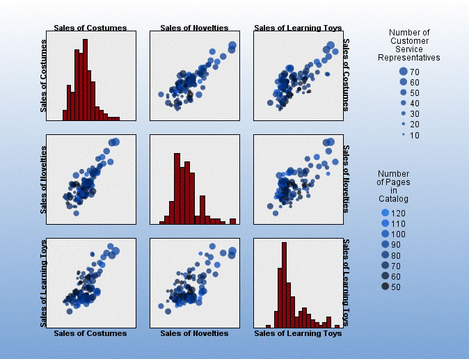
The visualization approaches taken by leading BI companies vary significantly. Some have built out their capabilities nicely — notably MicroStrategy and SAS — while others continue to promote more-of-the-same-but-glitzier graphs and charts. In a worst-case scenario, we even have a major analytics vendor that's fumbled its latest visualization launch. What should we avoid? Check out this dreadful graphic, published to the Web to promote that latter vendor's product launch. No axis labels on the individual plots. Use of the same labels for both trellis axes so that one of the axes must be mislabeled. Scatter-plot design elements (color, dot size) that are so poorly chosen that no information would brought out even if the axes were labeled. And I don't have a clue what's shown in the bar charts (histograms). Click on the graphic to enlarge in a new window. Does this vendor produced example communicate any useful information to you?
Fortunately, other software vendors do better. Among the BI majors, I'll cite MicroStrategy and SAS BI as examples. The companies' offerings have long at least matched the BI graphics capabilities of their large-BI-vendor competitors. Visualization releases over the last 18-20 months have put them a step in advance.
Start with MicroStrategy, which unveiled its current-generation visualizations in early 2007. We have, for example, a trellis, a means of adding a couple of dimensions to your display without cluttering individual plots, but far more clearly executed than in the competitor example I reposted above. The widgets released last month really caught my eye. I like the interactive bubble chart example, which I immediately recognized as a reworking of the Gapminder Flash animations that I wrote about a couple of years ago. In fact, MicroStrategy Director of Product Marketing Brian Brinkmann acknowledges that his company had adapted researcher Hans Rosling's ideas for its BI customers. Brinkmann explained that many of MicroStrategy's widgets, some designed for data exploration and others for presentation, are customer-demand driven. You can find additional MicroStrategy samples on-line.
 In SAS's case, the business-visualization capabilities offered by the JMP 7 software component captured my interest. JMP is a free-standing statistics package developed at SAS that was first integrated with the SAS Enterprise Intelligence platform in the spring of 2007. SAS formally launched Visual Data Discovery in July. The company's examples speak for themselves, despite the posting of screenshots that don't convey animation capabilities.
MicroStrategy's and SAS's competitors have not neglected visualization. Their efforts, however, have taken them in directions that are of less technical interest. In one case, we have packaging of standard chart types in a variety of file formats, some of them embeddable, supporting basic exploration via mouse-over, click-to-filter/subselect, and animation sliders. Another competitor has focused on enhancing function-specific graphics, for instance, for performance management, operations, HR, and sales, by enhancing those same, standard bar, pie, and line charts with elements such as range bands. I have to say, the samples I've viewed often look pretty but fall short in realizing the information-delivery potential of advanced visualizations.
Why not have both: business-domain appropriate visualizations and also sophisticated options that (when competently used) can tease difficult-to-discern knowledge from numbers? This seems to be the operating principle for both MicroStrategy and SAS, still unmatched by the other BI heavyweights 18-20 months after they launched their current BI-visualization offerings.
The SAS and MicroStrategy visualizations don't significantly compete with those from visual-analytics vendors such as QlikView, Tableau, and TIBCO Spotfire, nor, in this BI-specific instance, with advanced visualization available in data-mining packages such as R. The different categories by-and-large appeal to different market segments. Advanced BI visualization, when effectively delivered as described in this article, is a welcome addition to the mainstream BI toolkit.Advanced visualization isn't easy to get right. Some leading BI companies have built out their capabilities nicely — notably MicroStrategy and SAS — while others continue to promote more-of-the-same-but-glitzier graphs and charts. In a worst-case scenario, we even have a major analytics vendor that's fumbled its latest visualization launch.
About the Author
You May Also Like


