Visualize Balance, Visualize ChangeVisualize Balance, Visualize Change
The best BI visualizations bring out essential information that might otherwise remain hidden in data. A Washington Post visualization of President Obama's proposed $3.8 trillion budget for fiscal year 2011 does just that. There's much to be learned from a New York Times example as well, in particular about visualizing change.

The best BI visualizations bring out essential information that might otherwise remain hidden in data. A Washington Post visualization of President Obama's proposed $3.8 trillion budget for fiscal year 2011 does just that. The Post's viz tells a complete story: Budgets include both expenditures and revenues and this viz counter-balances the two. Contrast with other budget views, such as one that appeared in the February 1 New York Times, that focus solely on spending, telling only half the story, albeit with a much deeper level of detail. There's much to be learned from the Times example as well, in particular about visualizing change. Strong visualizations speak for themselves; if a picture is truly worth a thousand words, we shouldn't need a lot of text to explain it. I see a need to expend very few words to describe what I like about the Post's budget viz. It makes two key points crystal clear: the magnitude of borrowing necessary to complement receipts on the "Where the money comes from" side and the huge amount of mandatory (versus discretionary) spending on the "Where the money goes" side. Each side is broken down by major components. You can explore further via tabs for historical taxes/revenue, spending by type, spending by agency, and surplus/deficit. Those latter charts make effective use of interactive effects -- mouse-over data labeling and normalized and drill-down area charts -- without presenting so much data that the viewer is overwhelmed, losing track of the context.
The New York Times's graphic shows only proposed spending. A corresponding view of the revenue side, the rest of the story, would have been welcome.
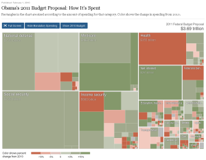
 The Times's graphic is a treemap that presents spending by type, broken down hierarchically into subcategories within each major category. The graphic is multidimensional. It uses area sizes to depict relative spending for each major category and subcategory, and it uses a color scale to relay percentage 2010-to-2011 spending change for each.
The Times's graphic is data rich. It uses mouse-over effects to present data figures and lets you zoom in on each major category so that you can see data for smaller subcategories. "Trade adjustment assistance, training" goes from $0.69 billion in 2010 to $0.28 billion in 2011, a change of -59.5%? What could that be about? Given the amount of data presented, a way to drill-though to explanatory information would also have been welcome.
A button allows you to show/hide mandatory spending. There's a trade-off in seeing detailed discretionary items (the Times) versus the juxtaposition of discretionary and mandatory spending against revenues (the Post). The Times viz feature I like the most, actually, is another button that lets you toggle between 2010 and 2011, which shifts the size of the spending-item areas. It's a neat way to bring out proposed spending changes.
I'll mention a related New York Times visualization, Budget Forecasts, Compared With Reality, published on February 2. I like especially the way it walks you through the story via a succession of six animated, interactive graphics, similar in composition to the "The Jobless Rate for People Like You" visualization that I wrote about in a November article, True BI for the Masses
I think the Washington Post and New York Times visualizations I described in this article are also great examples of BI for the Masses, "accessible, to-the-point BI delivered via everyday channels. Analytical functionality is stripped down to essentials that suit the user, data, and medium," as I wrote in November. These newspaper graphics report public stories. They're not about corporate performance management or marketing-campaign analysis or sales forecasting, but they're strong examples of useful, consumable BI all the same. For those with a narrower view of BI: my next article, which I'll have out soon, will relook BI for the masses delivered via noteworthy new tools from Indicee and Tableau. Stay tuned.The best BI visualizations bring out essential information that might otherwise remain hidden in data. A Washington Post visualization of President Obama's proposed $3.8 trillion budget for fiscal year 2011 does just that. There's much to be learned from a New York Times example as well, in particular about visualizing change.
About the Author
You May Also Like


