The Information Cannot Speak for ItselfThe Information Cannot Speak for Itself
Massive IT investment won't matter if users are unable to make sense of the data. With businesses reliant on information, presentation can no longer be an afterthought. Here's how you can improve that first impression.

Though critical to the success of information technology, nontechnical factors often go unnoticed. Industry voices frequently alert us to the more common nontechnical pitfalls: inadequate executive sponsorship, failed management of user expectations, and unrealistic project scope. But there's one more thing — and it has little to do with technology and nothing to do with project management. It's fundamental to the successful use of information. I'm talking about data presentation.
Business intelligence is a hot topic today — and rightfully so. Through BI and its cousins and aliases — decision support, data warehousing, and information management — we pay great attention to data acquisition, integration, cleansing, enrichment, access, analysis, and reporting. We pay comparatively little attention to the design practices needed to present data effectively and efficiently. The cost to business is insidious, for it is rarely recognized.
Unfortunately, no matter how much information you provide through the use of BI technology, it is only worthwhile to the degree that those who analyze and pass it on to others succeed in presenting it effectively.
Failure to Communicate
At the core of this problem is the presentation of critical quantitative information: the numbers that measure business performance. More often than not, the presentation of quantitative information fails to communicate information clearly and efficiently. In the course of your work, how many times have you heard information consumers plead: "Just show me the numbers!" Most quantitative data, such as key performance indicators (KPIs), are communicated in the form of tables and graphs. Unfortunately, most tables and graphs created in the course of business are designed poorly. Why? Very few of us — including financial analysts and other specialized report developers — have ever received training in effective table and graph design. Why not? In part, because too few examples exist of good design to expose the deficiencies of the tables and graphs that we produce and use every day.
Most data displays are time-consuming and difficult to read. They are filled with unnecessary information and visual fluff and at times are even misleading. In 1997, Edward R. Tufte, one of the world's leading experts in the visual presentation of information, convincingly demonstrated that the 1986 explosion of the space shuttle Challenger, which resulted in the deaths of seven astronauts, was in part the result of poorly designed presentations to NASA officials about the potential risk of O-ring failure. Tufte felt that if the potential risk of O-ring failure in cold temperatures had been presented properly, decision makers would have understood the extreme risk involved and surely would have postponed the launch. An avoidable tragedy occurred because of an information presentation that was misleading. Every day, just like the officials at NASA, you rely on good data to inform your decisions. Lives may not be at stake, but livelihoods certainly are.
We invest billions of dollars annually in technology, but far too often it fails to deliver on the promise of improved productivity. "Do it yourself" software has lured us into the false hope that we need only install and make technology available for use and the rest will take care of itself. For instance, the proliferation of electronic spreadsheet software back in the PC's early days made the creation of tables and graphs as easy as "1-2-3" (literally, Lotus Development's Lotus 1-2-3 at the time). For many companies, perhaps it was too easy.
Producing information through the use of a computer often gives the results an air of authenticity that they don't deserve. To use information technology effectively, people still need fundamental skills in the analysis and presentation of information — skills they ignore at their peril. A relatively small investment in the development of skills can make the difference between the success and failure of a large investment in the whole stack of technology put in place to create an efficient and effective decision-making and information flow.
Wake Up, Vendors!
You might argue that BI software takes care of effective data presentation for us by providing functionality that makes choosing the right design easy. For example, BI software usually provides formatting defaults that adorn our tables and graphs with just the right look. I wish this were true. In fact, BI software has contributed as much to the problem of bad data presentation as it has to its solution. In their frantic efforts to compete, software vendors can easily lose sight of what really matters — and what really works.
There's no excuse for this sad state of affairs. Twenty years ago, Tufte published his landmark book, The Visual Display of Quantitative Information, in which he eloquently argued that we should "above all else show the data." His books then proceeded to show us how. Shame on those BI software vendors — supposed experts in data presentation — that haven't studied Dr. Tufte's works! Even greater shame lies with those of us who have studied his works and praised them — but have failed to practice what he teaches.
No BI software feature illustrates this disregard more than the relatively recent addition of three-dimensional (3D) graphing functionality. Go to the Web site of any BI or data visualization software vendor, and you'll see eye-popping examples of the most absurd applications of 3D. Sure, these look impressive on the surface: but in almost every case, the use of 3D actually makes data harder to read. Such charts offer a telling example of what Tufte calls "chartjunk."
Does the addition of 3D to the line graph in Figure 1 add any meaning or value whatsoever? Absolutely not! It's much harder to tie a 3D version of a line (what some vendors call a "ribbon") to the associated values along the quantitative scale. Give it a try.
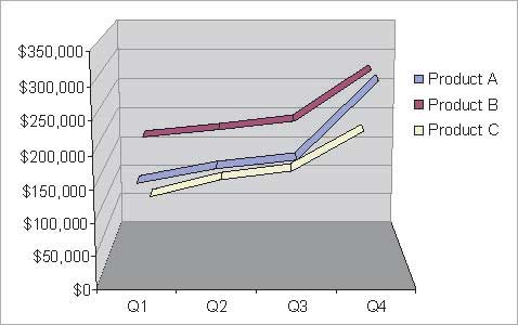
FIGURE 1 - 3D graphics for BI: Is the data presentation easier — or harder — to understand?
Alternatively, does the addition of a data dimension through the use of a third axis (that is, a z axis) display the data effectively? Take a look at the example in Figure 2 and see what you think. Can you read all the values? Of course not; a fundamental characteristic of a third axis is that it causes some data objects to be positioned behind — and thus be obscured by — others. "Wait," some vendors might protest, "this is why our software allows you to rotate the graph so that you can look behind things." The power of graphs is their ability to present the shape of the data all at once, within a single eyespan. There simply isn't any way that you can construct an effective view of the data by rotating a graph back and forth and piecing the separate images together into a meaningful whole in your mind's eye.
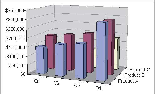
FIGURE 2 - The addition of a z axis does not tend to make it easier to read data values.
Go to any BI or data visualization vendor's Web site or flip through the user documentation. You'll see examples like these and much, much worse. But enough of this harangue: BI vendors are providing us with better tools all the time. The time has come to give serious attention to the problems of poor data presentation. This is an area where BI software vendors should lead the industry.
Effective Communication
For critical information to have the desired effect on your organization and to realize the benefits that your organization should reasonably expect from an investment in BI technology, you must focus on the effective communication of that information. Effective communication is not intuitive: It must be learned. The information cannot speak for itself. Don't let your hard work and budget go to waste through poor data presentation. Just having a set of report design standards isn't enough. If users and developers follow such standards, they'll produce consistency, which is great. However, if no one incorporates best practices in data presentation, the reports will just be consistently bad.
Figures 3 and 4 illustrate the difference between uninformed visual design and that which is firmly rooted in an understanding of how people visually perceive information. Despite its familiar nature, the first graph (Figure 3) misses the mark. Imagine that an analyst is using this graph to communicate to Company G's executive management team how it's doing compared with its competitors. Does the graph in Figure 3 tell the story effectively and efficiently?
If the executives studied Figure 3 long enough, they could approximate how well Company G is doing, but that's time they could be doing something about the information, rather than trying to figure it out. The analyst, sensing the inadequacy of this pie chart, might spruce it up by adding 3D. Figure 4 displays the result, which is even worse. Everyone may be dazzled by 3D visual effects, but these effects make the graphs even more difficult to read.
If you were the analyst, how might you approach this task? Remember, your purpose is to communicate. How might you effectively present the performance of your company relative to the competition? Figure 5 shows a simple solution that works quite well. There's nothing fancy about this design, yet it's quite effective. It communicates clearly and efficiently. No more than a few seconds would pass from the time executives saw this graph to the time they could begin knowledgeably discussing plans to beat the competition.
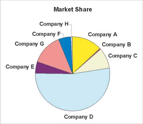
FIGURE 3 - The graph might look good, but it takes too long to figure out the information.
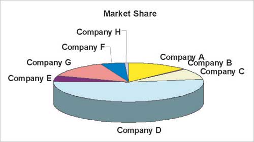
FIGURE 4 - The addition of 3D to Figure 3 makes the information even more difficult to read.
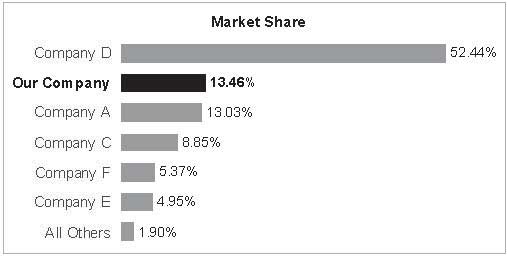
FIGURE 5 - Nothing fancy, but a simple and effective design.
Effective data presentation is rooted in an understanding of visual perception: What works, what doesn't, and why. Just as a good business analyst understands business and a good manager understands people, so a good BI professional must understand visual perception and the nature of meaningful information.
Visual Clutter
Let's take a look at one more example, in Figure 6, of the graphical labyrinth that we navigate daily in our frustrating quest for the data. Without this graph's title, would you have any idea that its specific purpose is to compare the sales performance of the product named SlicersDicers to the performance of each of the other products? In the general field of design, we speak of things as having "affordances": that is, characteristics that reveal how they should be used. A teapot has a handle. A door that you need to push has a pushplate. The design of something should suggest — in and of itself — how it should be used. This graph, however, relies entirely on its title to declare its purpose. Not only does its design fail to suggest its use, it undermines it.
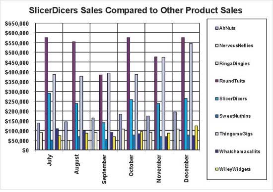
FIGURE 6 - The graph offers visual clutter, full of details that don't communicate important data more effectively.
What's wrong with the graph in Figure 6? For one thing, it's visually cluttered. Too much is going on and much of it has nothing to do with the data. Notice that the heavy grid lines in this graph get in the way of seeing the shape of the data itself. The grid lines serve no useful purpose. Now consider the legend, which contains nine labels for the differently colored bars in the graph. To interpret which bar represents which product, you must shift your attention back and forth between the legend and the bars again and again. This is time-consuming and frustrating.
Now, take a look at Figure 7, which supports the message directly, clearly, and efficiently. The creator of this presentation has a clear grasp of the message and, through an understanding of visual perception, designed a display that communicates that message vividly.
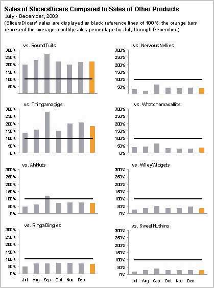
FIGURE 7 - A better version of the information in Figure 6: This graph exhibits a clearer grasp of the message being communicated.
What You Can Do
Does the level of expertise in report design that I've illustrated require many years of training and experience? If it did, you might argue that the cost of the remedy would exceed the cost of the problem, but it doesn't. The practices that produce consistently effective data presentations aren't all intuitive, but they're all easy to learn.
As a professional concerned about BI, you're in a unique position to recognize the need for better data presentation and, most importantly, do something about it. You understand the importance of business information and of presenting it to decision makers in a way that tells them what they need to know, quickly and accurately. Your perspective makes you an ideal advocate for this cause. You care about the health and success of your business and want your contributions to effectively promote strategic goals. Don't let your company get caught up in the technology race and forget the fundamental skills required to make effective use of the information delivered by that technology. Enlightening data presentation is a skill that you can learn, but only if you first recognize the need and then give it the attention it deserves.
Stephen Few is the founder of Perceptual Edge, a consulting firm that specializes in information design for communication. His new book, Show Me the Numbers: Designing Tables and Graphs to Enlighten, will be available from Analytics Press in July 2004.
Editor's Note: With this article, we begin a practical series of articles by Stephen Few devoted to data presentation. We look forward to readers' feedback, including good and bad examples of data presentation that you've encountered. (We can change the names to protect the guilty.)
About the Author
You May Also Like


