Clean Your Data with Visualization and Algorithmic TestsClean Your Data with Visualization and Algorithmic Tests
Speakers at Bio-IT World explore techniques for biotech researchers and others working with big data to identify the accurate data in their data files.

While pundits identify volume, velocity, variety, and even complexity as fundamental elements of big data, nobody ever seems to include accuracy. Consequently, the more data you have, the more false data you have.
How do you find it?
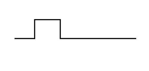
"This is sort of an old problem," Michele Busby, a computational biologist at the Broad Institute, tells me as we sit kitty-cornered to each other in the press room at the recent Bio-IT World Expo in Boston. She then excuses herself from the table to get a piece of paper and a pen. When she returns, she draws a diagram that looks like this:
"Ideally, your data would look like this," Busby tells me as she pushes the piece of paper forward. "That's what clean data looks like."
The perennial problem that data scientists face is bias, or "background noise." Whereas the diagram above shows one clearly defined "peak," informaticians frequently wind up with charts containing variations and additional, "fake" peaks -- red herrings all.
The day before our interview, Busby delivered a presentation at a conference workshop on optimizing algorithms to avoid this conundrum in her own line of work – next-generation sequencing (NGS) of human genomes.
"Sometimes peaks are easily found, but sometimes…there's a lot of noise," Busby told a roomful of people involved in genomics and bioinformatics. "It's not immediately obvious where the [real] peak is."
"The solution that people use," Busby subsequently tells me, "is that they sequence [with a] control."
By normalizing input data for fragment size and using it as a control across multiple (and, preferably, large) data sets over and over again, Busby explains, the peaks can be eventually "flushed out."
"So basically what you do is you have your reads and your putative peaks," explained Busby in her presentation, "and then you subtract the read from the control, and use that as your true read count -- or some version of that. Maybe [you] divide if there's more complex math involved."
This is the simplified explanation of a paper Busby has coming out later this year on this difficult – and often discussed – problem.
"The informatics the people use to do QA on [genomics] samples is still [a] really underdeveloped field," Busby announced. "The problem…is it's very difficult to develop a QA metric for any area you haven't seen yet."
"Seen" is the keyword here. Chase Miller, director of research and science at the University of Utah, emphasized in his own Bio-IT World presentation how essential data visualization is to solving these analytic conundrums.
"Visualization. This is pretty easy, but most analyses still really don't do it," stated Miller. "Pull visualization into the analysis[,] so you better understand both the data, and your results."

"Knowing the right question to ask is even harder," alleged Miller, than answering it. Accordingly, integrating data visualization into ongoing analysis itself is vital to both understanding and accuracy.
Repetition -- in a controlled setting -- is key.
"What we have to do in biology… is just doing the same thing over and over again," Busby explains. "We want to make those errors in the lab…so we know what they look like."
This way, says Busby, you begin to understand the latent biases of your own data, methods, and systems such that you can accurately account for them – and, in doing so, effectively identify and discount "noise."
"It's not even an informatics problem; it's an understanding the world problem," concludes Busby. "A lot of what you're doing isn't tweaking the math; it's just understanding your features."
Read more about:
2016About the Author
You May Also Like


